반응형
다음과 같이 div 안에 이미지를 넣고 그 위에 투명한 div가 올라오도록 하는 이미지를 만들어보았다
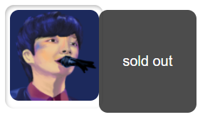
컴퓨터에 마땅한 이미지가 없어 예전에 그려두었던 호시노겐 그림을 넣었다
그냥 이미지 HTML
    <div class="item-box">
      <div class="image">
        <img src="../assets/image.png" alt="">
      </div>
    </div>
CSS
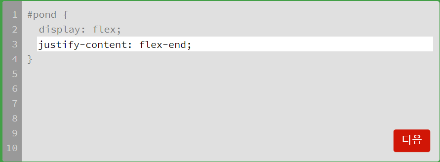
  .item-box{
    width: 100px;
    height: 100px;
    padding: 5px;
    margin: 5px;
    box-shadow: inset 1px 2px 4px rgba(0, 0, 0, 0.25);
    background: #fff;
    border-radius: 10px;
    display: table;
  }
  .image{
    display: table-cell;
    vertical-align: middle;

  }
  img{
    width: 100%;
    border-radius: 10px;
  }
이미지를 가운데 정렬 시키기 위해서 부모 div의 display 를 table 로 만들고 자식 div에 display : table-cell을 준 후
vertical-align : middle을 주었다!
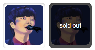
div 겹친 HTML
<div class="item-box">
  <div class="image">
    <img src="../assets/image.png" alt="">
  </div>
  <div class="sold-out">
    <p>sold out</p>
  </div>
 </div>
다음과 같이 내가 원하는 div의 직속자식으로 sold-out 클래스를 가진 div를 만들어주었다
CSS
  .item-box{
    position: relative;
  }

  .sold-out{
    position: absolute;
    left: 0px;
    top: 0px;
    width: 100%;
    height: 100%;
    display: table;
    background: rgba(0, 0, 0, 0.7);
    color: #fff;
    border-radius: 10px;
  }

  .sold-out > p{
    display: table-cell;
    vertical-align: middle;
  }
item-box 클래스에는 position : relative 값을 추가해주고
sold-out 클래스는 position : absolute 값을 주었다
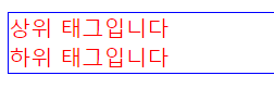
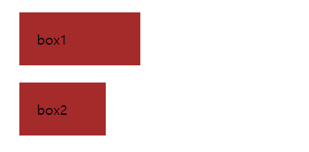
처음 다른 블로그를 참고하여 부모에 relative 자식에 absolute 값만 줬을 때는 이런식으로 자식 상자가 옆으로 가벼렸는데
left : 0px; right : 0px을 줘서 위치값을 초기화 시켜주면 원하는 위치에 이동한다!
반응형
'study' 카테고리의 다른 글
| [Vue.js] 팝업 창 만들기 (0) | 2022.05.02 |
|---|---|
| [Vue.js] Vue2 에서 라우터 문제가 있을 때 (0) | 2022.05.01 |
| Vue.js 프로젝트 시작하기 (0) | 2022.04.28 |
| [JavaScript]Parsing error : Invalid shorthand property initializer 오류해결 (0) | 2022.04.28 |
| [python] UDP 클라이언트와 서버통신 (0) | 2022.04.04 |